Branding
FoxPlan
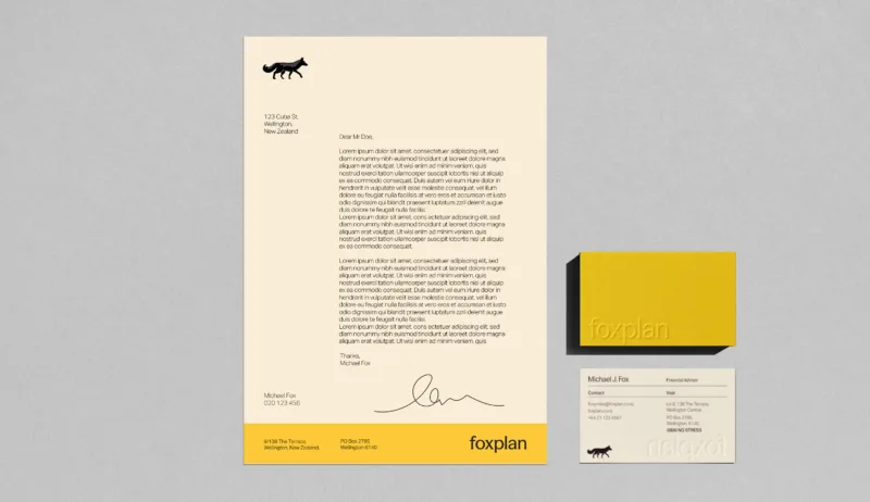
After more than 30-years in the financial services industry, our client needed a new brand identity. The goal was to build on their history while creating a modern look that would resonate with a new generation of clients.
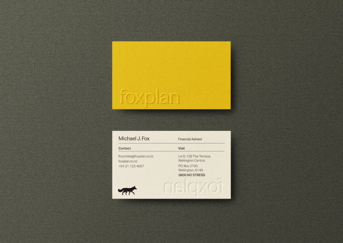
The new brand taps into the sense of relief that being on top of your finances feels like. Our fox icon takes on the role of financial guide. You’ll see snippets of them throughout the visual brand in patterns like our tail devices and track marks, leading clients toward total financial clarity.
We kept the heritage feeling by pairing the fox with a combination sans-serif and serif typefaces for the Wordmark. FoxPlan’s heritage colours have been updated to a softer secondary palette of blue, peach and beige have been introduced to give the brand a fresh, calm and contemporary feel. Finally, the art direction includes Kiwis in a range of relaxed outdoor scenes to capture that feeling of financial freedom.